
Interior design is a crucial part of creating a comfortable living environment. Your interior space should not just be functional or aesthetically attractive; it should complement your physical and emotional needs. Are you asking how to achieve this? You can effectively design the interior with the help of colour psychology in interior design. Each colour you use within a house greatly impacts the mood, behaviour, and overall well-being of family members. To create your house interiors to resonate with the hearts and minds of your family members, read this blog about the psychology of colours in the interior design of a house.
What is Color Psychology?
You can understand colour psychology in interior design as the theory of how each colour influences an individual’s mood, creativity, cognitive functions, and efficiency. Colour manifests how our brain and vision sense different wavelengths of light. Therefore, you need to choose the colour shades cautiously to create a welcoming atmosphere.
Significance of Color Psychology in Interior Design
You need to understand the relationship between colours and emotions before applying them. The following are some reasons that you should know about colour psychology in the interior design of your home:
- Emotional Impact:
Different colours can stimulate different emotions and feelings within a person. Warm hues can create a sense of energy and excitement, while cool tones promote calmness and relaxation. To create a balanced atmosphere, you should strategically incorporate suitable colours in different areas.
- Mood Betterisation:
Colours have the power to uplift and depress your mood. By choosing a soft and muted tone, you can create a tranquil ambience. In contrast, bright shades infuse joy and positivity, making a space feel more vibrant and lively.
- Visual Impression:
The experience you feel within a space greatly depends on their colour. If you sit inside a room designed with lighter shades, you feel the space is wide and spacious. However, darker shades form an intimate ambience. When you use different colours in a room, you can make it feel bigger, deeper, or more lively. This helps the room look nicer and more attractive.
- Personal Expression:
You can customise the room based on your interest. It helps to express your vibes and preferences along with style.
The Impact of Warm Colours on Interior Design
You can add a sense of calm and security to a space by including warm hues. Warm colour shades include red, yellow, orange, beige, brown, creamy neutrals, and tan.
Red Interior Design
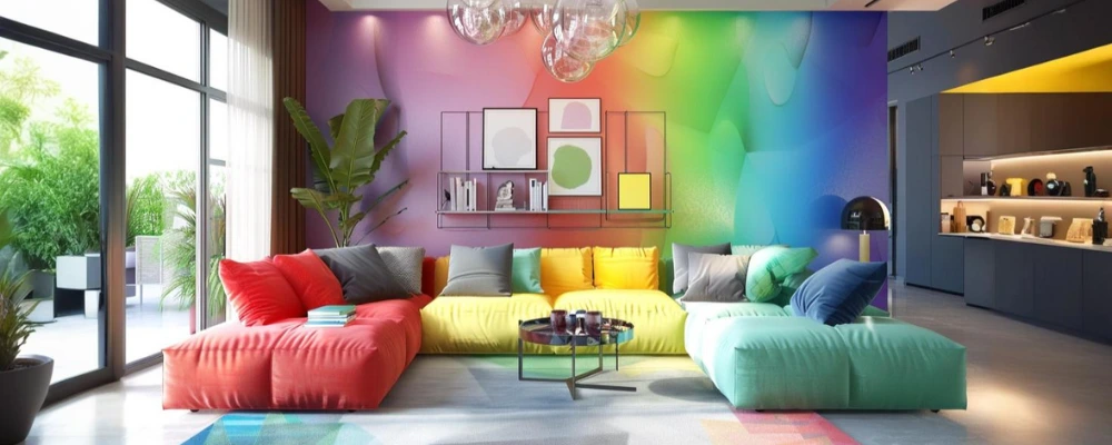
The red shade is famous for its strong psychological effects on people in a space. It can enhance energy levels and promote a sense of passion and excitement. Red can also develop a sense of urgency and intensity, making it a good pick for areas where action and productivity are expected. Red can increase heart rate and blood pressure, which can stimulate the body’s metabolism and make people feel hungrier. However, keep in mind that only sensible use of red works well; overuse of red can cause overwhelming feelings and create a feeling of restlessness.
You can use red with contrasting colours, such as
- Primary red with yellow, white, tawny-orange, green, blue and black.
- Tomato red with cyan, mint green, sand, creamy white, and grey.
- Cherry red with azure, grey, light orange, sandy, pale-yellow, and beige.
- Raspberry red with white, black and damask rose.
This red wall colour is suitable for bedrooms, living rooms, and kitchens.
Yellow Interior Design
Yellow is the colour of gold that symbolises sunshine. It can bring a sense of positivity into the home. It is the colour of happiness that is connected with intellect and prosperity. This colour can automatically uplift an individual’s spirits, making the room bright and sunny.
Although most shades of yellow positively affect the psyche, dull yellow colours provoke a feeling of doom, decay, and sickness. You can use bright yellow shades sparingly within the house. Too bright yellow can spark agitation, and a too-dull yellow can cause jealousy or illness. Always make it a combination with white or grey, as a completely yellow room can inflate blood pressure. This yellow wall colour is suitable for bedroom, living rooms, dining areas, and kitchens.
Orange Interior Design
According to colour theory in interior design, orange breeds creativity. Orange and its other shades offer a positive effect on the psyche. Its vibrant warmth shade can enegise you. It promotes a sense of cheerfulness.
It works well in bathrooms, kitchens, and other places where yellow would be suitable, too. Orange inspires desire, love, sexuality, and appetite. Keep in mind that it can be overstimulating, mainly in rooms where relaxation is desired, and it can be challenging to coordinate with other colours. You can include orange with blue, grey, white, green, and black in a balanced way. This orange wall colour is suitable for living rooms, dining areas, or even home offices.
Brown Interior Design
You can include brown interior elements like plants and natural materials in the home to relieve stress. According to colour symbolism, shades of brown offer feelings of comfort, peace and security. Brown colour can help to connect us to the earth and make us feel more grounded and calm. You can use brown sparingly to maintain minimalism. The colour brown can make you feel calm and peaceful. But if there’s too much of it, it might make you feel lazy or like you don’t want to do anything. However, brown with bright colours or other natural colours can make you feel strong, stable, and safe. This brown wall colour is suitable for living rooms, bedrooms, and kitchens, as it creates a warm and cozy feeling in the space.
The Impact of Cool Colours on Interior Design
Cool colors are often used to create a calming and refreshing atmosphere in interior spaces. These shades evoke a sense of relaxation and serenity, making them ideal for rooms where unwinding is a priority. Common cool color shades include blues, greens, and purples.
Blue Interior Design
Blue indicates water elements like the sea or swimming pools. You can consider a blue-coloured interior as the most calming space. According to colour psychology, blue gives a relaxing feel to the mind and slows down heart rate, metabolism, blood pressure, and hypertension. You can use sky blue or light blue to create a healing environment. Blue is a special colour because it mostly makes people feel good and has very few bad effects on the mind. When you use blue in home design, it can make your space look stylish and peaceful. You can add small touches of blue or paint a whole wall blue to make a strong impression. Using blue also shows that you have a smart and classy style. This wall colour is suitable for kitchen, living rooms, and bathrooms.
Green Interior Design
Green colour is connected to nature and vegetation; This natural colour gives freshness, health, and tranquillity to the human mind. Many psychologists and researchers have suggested that green is a healing colour. Green provokes motivation, creativity, and imagination. You can coordinate green with neutral colours like white and grey or warm colours like red and orange. Adding green elements like plants also enhances the healthy environment. Too much green in a space or being surrounded by the wrong shade of green can bring up feelings of boredom or stagnation. This wall colour is suitable for home offices and study areas.
Purple Interior Design
Purple colour is associated with royalty and luxury. This colour offers a soothing feel and stimulation. Purple colour hues inspire creativity and design. Purple offers multiple shades. Bright purple hues such as violet or plum add flair to house design. Meanwhile, light purple shades such as lavender and mauve form a calm but regal effect within the interior. You can combine purple with metallics of gold or copper. This wall colour is suitable for bedrooms and meditation rooms.
The Influence of Neutral Colors for Interior
Neutral colours are often used to maintain sophistication with minimalism. These shades are often used as a backdrop and as primary colours to create a serene and spacious feel. The common neutral colour shades are whites, greys, and beiges.
White Interior Design
White represents peace, purity and acceptance. White walls can reflect maximum light, creating a brighter and wider atmosphere. White interiors include a fresh and pristine glance, making the space feel warm, homely and inviting. This neutral colour easily fades into the background, helping create a distraction-free space. Different white shades include ivory, eggshell, cream, and vanilla.
You can combine white with gold, beige, light grey, and black to create a contrast. White can be used in any room to brighten and enlarge the space, especially in smaller rooms or those with limited natural light. For a textured yet clean look, consider incorporating a white brick wall to add visual interest while maintaining the bright aesthetic. It’s a versatile colour that works well as a base for other colours and can create a sense of calm and clarity.
Grey Interior Design
Grey represents elegance and style. Grey elicits different feelings in various people. If some people feel a calming effect, some others feel depressed by this grey colour. You need to use the proper tones of grey to avoid its side effects on the human mind. To use this grey shade as the primary colour, make sure the space has access to sufficient light. For safe play, use grey elements like curtains, furniture, and cushions rather than walls.
You can create a balanced colour combination of grey with white, yellow, or pink. This wall colour can be used in living rooms, bedrooms, bathrooms, and kitchens
Black Interior Design
Black symbolises mystery, sophistication, and power. It gives importance to simplicity and functionality. In modern interior design, black is commonly used for furniture, texture, and wall elements. According to colour psychology, you can’t use black for an all-black room design; it can feel down or gloomy. However, you can strategically pair black with red, white, blue, or another colour to create a balancing contrast. As per the Vastu colour principle and requirements, you can use this colour in any room.
Common Mistakes to Avoid According to Color Psychology in Interior Design
- Mistake 1: Applying vibrant or intense colours on large surfaces in small rooms.
The application of bright colours can make small spaces feel cramped, chaotic, and overwhelming instead of lively. Hence, use lighter, neutral colour shades for walls and major surfaces; this will help to reserve bright colours for accents like cushions or art.
- Mistake 2: Choosing colours without considering how natural and artificial lighting changes their appearance.
Colours may look different throughout the day. It can appear dull, harsh, or entirely different from what you expected. Therefore, observe colour samples at different times of day and under different lighting conditions before choosing one.
- Mistake 3: Skipping the step of testing paint samples on your actual wall or using only small swatches.
After the application of paint to the wall, the final colour may look different due to the underlying wall colour or surrounding decor, leading to disappointment. Therefore, paint large sample patches or use sample boards to view the colour in different spots and lighting before making a final choice.
Before creating an interior design for your house, you must always familiarise yourself with colour psychology in interior design. Sometimes, the psychological effects of these colours can differ from one place to another around the world. You can consult a colour expert or an experienced construction specialist like Brick & Bolt before choosing the colour palette for your house.